Data Visualization: Drawing with Data, with Concepts, and with Rules
SIDLIT 2013
SIDLIT 2013
Summer Institute on Distance Learning and Instructional Technology
(Colleague 2 Colleague)
August 1 - 2, 2013
@Johnson County Community College in Overland Park, Kansas
by Shalin Hai-Jew, Kansas State University
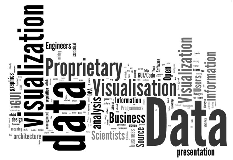
Fig. 1: The above is a Wordle(TM) diagram representing word frequencies in the current "data visualization" entry on Wikipedia. This "word cloud" data visualization may be accessed off of the Wordle Gallery at this location.
Presentation Description: Data visualizations enhance human comprehension, analysis, decision-making, and predictions. Data visualizations will be shown from three origins: (1) data, (2) concepts, and (3) rules. This begins with a basic data set structure and related visualizations in Excel. Then, various network visualizations will be shown from the free open-source NodeXL. A specialized map dashboard will be output from the free Tableau Public. Then, there will be a simple process of manual conceptual drawing in Microsoft Visio. Finally, there will be some rule-based visualizations expressed as changes over time (through agent-based modeling) with the free open-source tool NetLogo and its Models Library.
The "datafication" of society refers to a recent phenomena of turning aspects of the world into data that may be measurable, assessed, and analyzed. Broadly speaking, "structured" data refers to data of a particular defined type. Basic information types are numerical or textual. Within even those limitations, much information may be collected and understood. "Unstructured" data is multi-modal or multi-type data. The descriptions of data are known as "metadata" (data about data). There are many types of data structures (aka ontologies or taxonomies).
In the current age, there is much in the way of data collection. Governments collect plenty of data. Social media platforms collect data. Information and communication technologies (ICT) collect data. There are various types of sensor networks that collect data. People often leave "data exhaust" as a byproduct of the modern lives that they live.
For our purposes, worksheet flat tables have basic structures. The clear labeling of data variables is critical. Data sets should be as complete as possible, without gaps in information. The unique identifiers in a data set enable cross-comparisons across a range of different data sets.
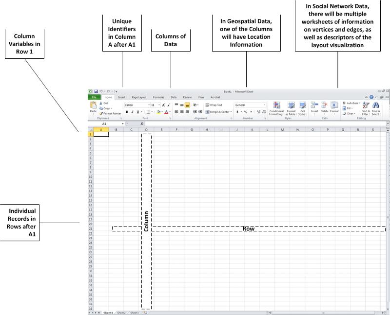
Fig. 2: A Worksheet Data Structure
Spreadsheet programs are used for pivot tables as well, which offer more information than flat tables. Pivot tables also include data that has been extrapolated as a function.
The act of data visualization, simply described, involves taking numerical, textual, spatial, and / or other data and rendering it in two-dimensional (2D, with an x-axis and a y-axis) or three-dimensional (3D, with an x, y, and z axis) visual form. Various types of data may be overlaid / compared / cross-analyzed with other data as long as there is a common variable to enable accurate relating of mixed records.
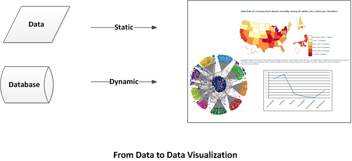
Fig. 3: From Data to Data Visualization
Conventions of the Field: The conversion of data to a visualization depends on the conventions of the field, the types of data managed, and how the data is used for human comprehension, analysis, decision-making, and predictions. They enable short-hand access to the underlying data through the uses of shapes, lines, colors, text, and sound (sometimes) to communicate meaning. In data visualizations, the use of space and spatial relations is important. Symbols (such as arrows) are important. Colors are important signifiers. Map and graph legends and textual pullouts and contextual text...are all important. Lines and line sizes and labels are important. Directionality is also important.
Applications of Data Visualizations: Data visualizations are simplifications or summarizations of the underlying data. As such, it is important to understand how the data was collected and to have access to the original data set(s) for deeper understandings. It is important to recognize how the original data are condensed and represented visually to enhance the accuracy of "visual mining" (perusing the visualization for understandings, trends, relationships, and other knowledge). The original data set enables analysis to individual record-levels of "atomistic" granularity. Data may be cross-referenced, sub-setting, extracted, abstracted, compared, contrasted, and "manipulated" in a variety of ways for informational value.
Disfluency: Data visualizations are created to probe data for more meaning. It is part of the analysis process that enables additional knowing. Sometimes, "disfluent" or dissonant representations of data may enhance analysis instead of an easeful and superficial view of the data. Disfluency may be used to combat "confirmation bias" in people and encourage new ways of seeing, analysis, and decision-making. (Said another way: Surprise can help people to reconsider assumptions.)
Complementary Usage: Data visualizations are used in a complementary way with the raw or processed data sets. The provenance (the origins of and the sequential processing) of data for the visualization is also important to consider for data validity. Data visualization is one method for turning raw data into information (something that offers understanding and analytical value).
Definition: Applying layout algorithms to data to create data visualizations
To draw with data means to let the data "structure itself" based on a set of data rules. Some of the examples below will illustrate how data can form a relational "structure." Depending on how the data was acquired, this may be considered empirical data captured by observation from the real world.
Data visualizations from Microsoft Excel are fairly familiar. Certain types of data align more "naturally" (by convention and logic) with particular types of visual depictions.
Microsoft Excel is a proprietary and commercial software tool.
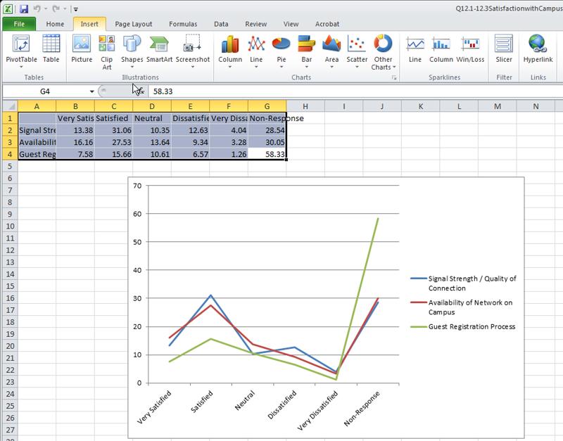
Fig. 4: A Screenshot of a Microsoft Excel Dataset and Related Linegraph
(We will conduct a few Excel visualizations with simple real-world survey data.)
A fairly recent kind of data visualization involves the depiction of "networks". These may be networks of people, information (contents), concepts, and any sort of relationship between "entities." The analysis of such networks are known as "network science." One subset of this learning involves social network analysis, and a subset of that would be electronic social network analysis.
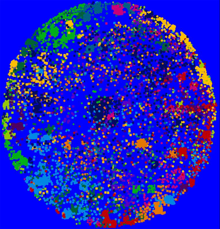
Fig. 5: A Data Crawl of the Barton Gellman User Network on Twitter and Visualized (Creatively) Using NodeXL
NodeXl (Network Overview, Discovery and Exploration for Excel) is a free and open-source add-in to Excel. It may be downloaded at the NodeXL space on CodePlex. This tool runs on more recent versions of Excel on PCs or on parallels on Macs. One functionality of this tool enables the extraction of data from social media platforms (like Twitter, Flickr, YouTube, and in a limited way, Facebook). Further, this tool may ingest contents from wikis through the use of the "web crawler" VOSON (Virtual Observatory for the Study of Online Networks) add-in to this tool. Some look to electronic data from social media platforms as information from "human sensor networks." In this concept, each human being's "data exhaust" and metadata may be used to observe particular phenomena.
In the demo, participants will see how one dataset may be visualized in a range of different ways.
To understand these layout algorithms in depth, an individual would do well to return to the original research and academic papers that describe these. The descriptions here are extremely cursory.
The NodeXL Excel template worksheet may be accessed at #datavisualization hashtag (Excel file) based on the data extraction (crawl) on June 2013.
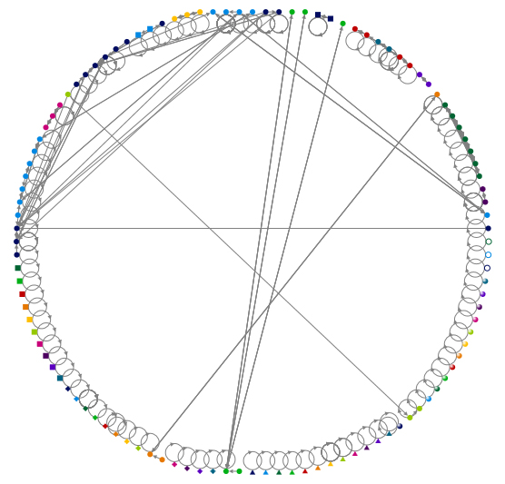
Fig. 6: A Lattice Graph of the #datavisualization hashtag search on Twitter (unlimited crawl) using NodeXL
Visit the NodeXL Graph Gallery.
For more information on electronic social network analysis, please refer to the following slideshow.
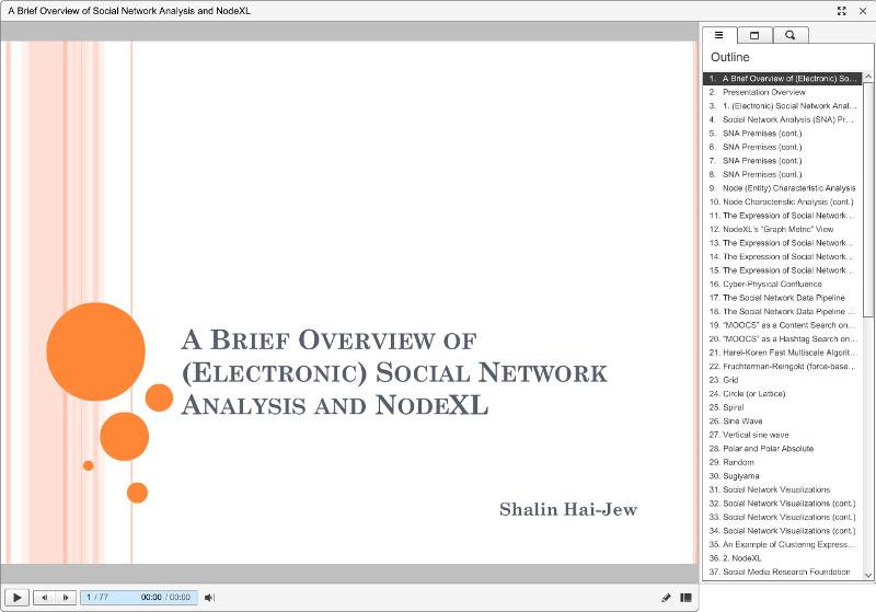
Fig. 7: "A Brief Overview of (Electronic) Social Network Analysis and NodeXL"
Book Resource: The book "Analyzing Social Media Networks with NodeXL: Insights from a Connected World" (2011, Elsevier) by Derek Hansen, Ben Schneiderman, and Marc A. Smith, is a powerful resource.
Another type of data structure involves the mapping of data to a location. Because people live and move in space, and there are influences of geographical / physical spatial proximity, this tool helps map data to place. The free and public version enables connection to data from MS Access, MS Excel, and text files. Those with professional access may draw data from specific servers. (The free version enables server access using OData or Windows Azure Marketplace DataMarket.)
The location data may be accessed with a column from zip codes, area codes, latitudes / longitudes (coordinate data), ISO country codes, FIPS codes, county / state / country names, and other forms.
The free Tableau Public version is limited by license and is a simplified version of a commercial software tool.
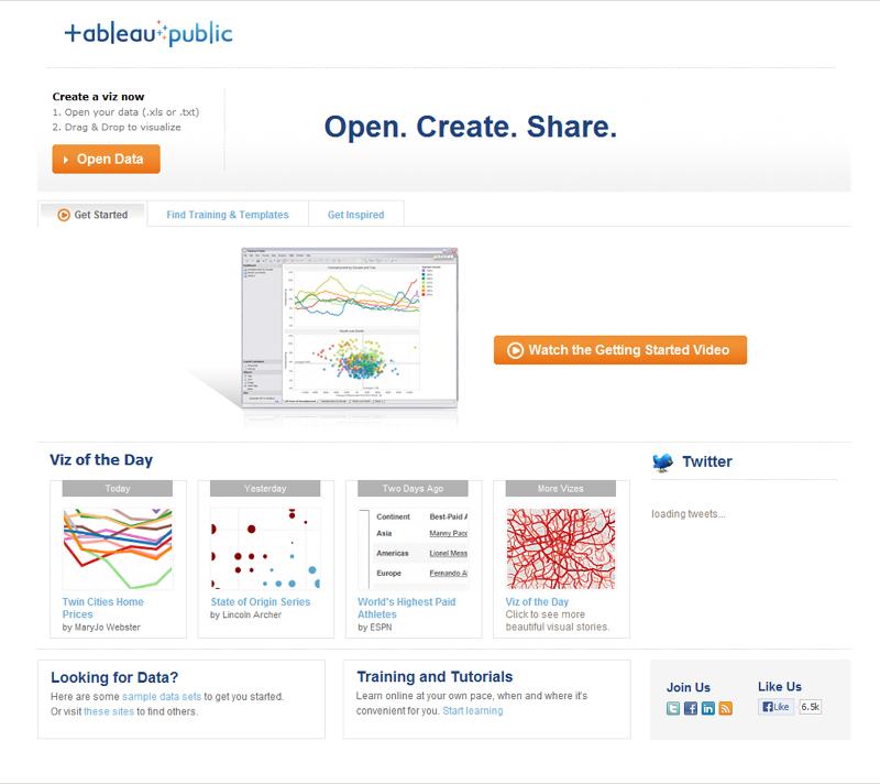
Fig. 8: A Screenshot of the Landing Page for Tableau Public
Visualizations may be seen in the Tableau Public Gallery. The related datasets may also be downloaded from the site.
Every Recorded Meteorite Impact on Earth: http://www.tableausoftware.com/public/gallery/registered-meteorite-impacts
Childbirth Economics: http://www.tableausoftware.com/public/gallery/childbirth-economics
New Planets: http://www.tableausoftware.com/public/gallery/newplanets
Fungal Meningitis Outbreaks: http://www.tableausoftware.com/public/gallery/fungal-meningitis-outbreaks
The World's Nuclear Reactors: http://www.tableausoftware.com/public/gallery/nuclear-reactors
Some World Agriculture Statistics (based on World Bank Databank Data)
Or you may visit the link directly here.
International Debt Statistics (World Bank) (based on World Bank Databank Data)
Or you may visit the link directly here.
(Thanks to Eric Dover for the MapBox reference.)
Definition: Creating a data visualization image manually (in a technology augmented way) by expressed theories or concepts, pure logic, descriptive observations, or normative conditions
Here, the data is abstracted inductively (there are mass observations of the world and rules are abstracted or generalized from that) or deductively (there are rules that are logically applied)... Drawing with concepts may involve "thought experiments" and imagination-based scenarios.
Another way to express a data visualization is to use a variety of drawing and diagramming methods to communicate ideas and relationships. These may be theoretical ideas. These may involve concepts. These drawings may depict models and ideas from pure logic or reasoning. (There does not necessarily have to be an empirical tie.)
MS Visio is a 2D diagramming tool that enables drawing for a variety of fields using various templates or a free-form grid. This tool has a wide range of other functionalities. Various data visualizations may be linked to spreadsheets or databases that will automatically update the data visualization.
MS Visio is a proprietary and commercial software tool.
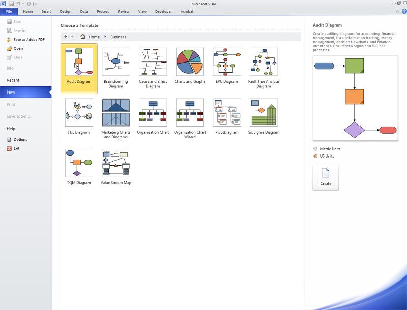
Fig. 9: A Screenshot of the "Business" Template Types in Microsoft Visio
(This is where we--as a group--will describe the process of a data crawl in NodeXL and co-draw a process in Microsoft Visio. We'll discuss some of the conventions of a 2D flowchart. The group-derived flowchart will be posted here after the conference.)
Microsoft Visio Templating from Various Professional Domains: Business, Engineering, Flowchart, General, Maps and Floor Plans, Network, Schedule, Software and Database
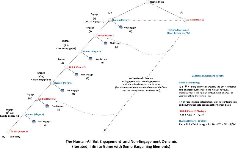
Fig. 10: An Application of a "Game Theory" Conceptualization of a Human Interaction with a Malicious Social 'Bot in an Immersive World
(The above is a sample of a "game theory" conceptualization that is essentially based on logic and concept. This diagram was created by the author and is in a copyrighted text.)
Definition: Using simple rules of agent-based behaviors at the micro level to understand how micro actions (at the agent level) affect the macro context to extract a 4D data visualization (with the inclusion of the 4th dimension, sometimes simplified as "time")
Here, real-world data is abstracted into machine rules. In a general sense, "drawing with rules" is also done with other types of computer-based simulations and models.
The basic core of many simulations and predictive programs involves the application of a range of rules (informed by life and statistical analysis) to particular simulated contexts. These may apply to simulation systems like neural networks that play out decision-making scenarios and various outcomes. These apply to other types of predictive modeling as well. (The rules used are a mix of hypothesis and empirical information, which may be used to "train" / inform the evolving simulation.)
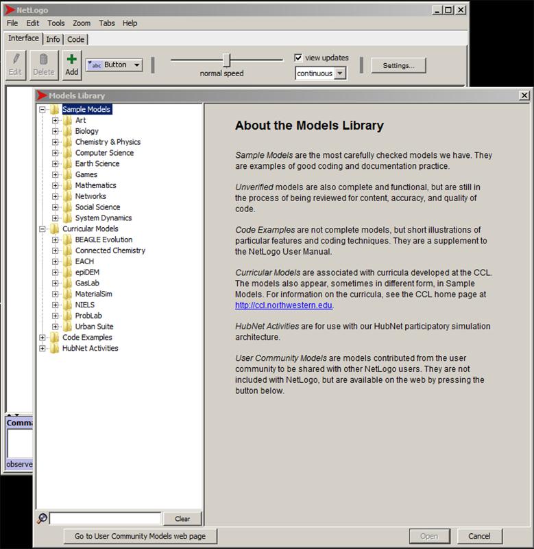
Fig. 11: A Screenshot of the NetLogo Models Library
NetLogo is an agent-based modeling language that expresses agent-based actions and decisions at the "turtle" level and their actions on "patches" (set up as a 2D grid or lattice). Some of these models involve parameters which may be adjusted for each run (or "tick" as in tick-tock) for an interactive visualization. Others have defined pre-sets. These are used to understand how simplicity at the agent level may lead to various unpredictable outcomes at the macro level, particularly as something is run over time. These are also used to show changes over time, in the near-term, mid-term, and long-term.
This modeling is based on the concept of "cellular automata," in which similar rules are written for the individual "turtles." The running of sequential iterations or updates sometimes result in surprising patterning, equilibrium states, and complexity.
The models in the NetLogo Models Library are based on findings in the research literature, which are then applied to the coding. These are tightly documented and described, and the code itself is available. It is important to read the notes on the models and actually the original research papers to understand the hidden complexities and assumptions of them model. (In the real world, a model is further nuanced / sensitized or trained with the input of real-world data.)
Note the three tabs: Interface, Info, and Code. These aspects may be understood as the interactive interpreter (Interface), the documentation (Info), and the script (Code) windows. The Interface is where the interactive simulation plays. The Info is editable in the local version. The code here is read-only, but the code may be repurposed in a different model.
NetLogo is an open-source (and free) tool created at Northwestern University by Dr. Uri Wilensky.
Biology / Social Sciences > AIDS
Parameters: initial people, % infected, average coupling tendency, average commitment (serial monogamy), average condom use, average test frequency, and others.
Social Science > Rebellion (based on Joshua Epstein's Model of Civil Violence, 2002)
Parameters: initial cop-density, initial agent-density, vision; government legitimacy; max-jail term; movement?
Social Science > Ethnocentrism (based on Robert Axelrod and Ross A. Hammond's model of ethnocentric agents, 2003)
Parameters: mutation-rate, initial-PTR (potential to reproduce), death rate, cost of giving, immigrants per day, gain of receiving, immigrant-chance-cooperate-with-same, immigrant-chance-cooperate-with-different
(The group will try a few more, but these will have to necessarily rely on intuitions based on the visualization, without prior preparation in terms of reading the notes about the model or looking at the code.)
Sample Models: The NetLogo Models Library contains sample models from a variety of fields: Art, Biology, Chemistry & Physics, Computer Science, Earth Science, Games, Mathematics, Networks, Social Science, System Dynamics, and others.
An online NetLogo dictionary is available.
Dynamical Systems Theory: This dynamics theory examines how the collective actions of many interacting components (or agents) result in complex and changing behavior at the macroscopic level. Complexity may emerge from agents that behave according to a few simple rules
.
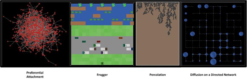
Fig. 12: A Quadtych of Four Visualizations from the NetLogo Models Library
Data visualizations come in various types.
Drawing with data involves using the raw or processed data to create visualizations.
Drawing with concepts involves using ideas and logic (or illogic) to create visualizations.
Drawing with rules involves using extrapolated rules (from empirical observations) to create visualizations. (These rules do not have to be drawn from "data," but for our purposes, it is. Rules may be drawn purely from the imagination.)
There are many other types of data visualizations. There are many that are 3D and 4D (with changes over time). There are many that are highly specialized to particular domain fields.
"Big Data" and Data Visualizations: The current chatter surrounds "big data" to understand patterns and sense-make. The analysis of big data enables the revelation of unanticipated relationships (relationships do not have to be known a priori). They may reveal unanticipated informational blind spots. With "big data," correlations trump causation; in other words, certain indicators may correlate with certain phenomena, and those indicators will be used for understandings and predictions even if the underlying causation is not clear
.
Big data sets themselves do not have to be as precise or clean as in a context of scarce data. This means that there may be cells with missing information in a big data set that is still used for analysis because the thought is that the massive amounts of data will make up for potential gaps. However, big data may lead to mistakes in correlations. Big data is prone to false indicators of correlation, but these apparent correlations may be only artifacts of the large amounts of noisy data. Some practitioners suggest that subject matter expertise will be much less important in decision-making than learning from real-world big data (which is considered empirical). Data visualizations are especially important for "big data" in terms of coherence in order to spark understandings and hypotheses, to identify potential trends, to identify critical "nodes" or clusters, to identify anomalies, and so on.
To engage big data, people will rely on data visualizations to understand complex inter-relationships.
Thanks to Drs. Julie Rorabaugh and Jonathan Bacon for the idea for this presentation. Per their request, I hope I was able to keep this sufficiently simple...while keeping this somewhat engaging
.
|
Contact Information Dr. Shalin Hai-Jew Instructional Designer Information Technology Assistance Center (iTAC) 212 Hale Library Kansas State University shalin@k-state.edu 785-532-5262
|