Using Tableau Public for (Spatial and Trendline) Data Visualization
(An Early Exploration and "TMI" Musing on Data)
(An Early Exploration and "TMI" Musing on Data)
Shalin Hai-Jew, Kansas State University
Colleague to Colleague Spring Forum 2012
(Apr. 20, 2012, Hutchinson Community College)
With complex data sets of educational information available, it helps to be able to provide Web-accessible and interactive visualizations of this data for more understandable analysis, collaborative decision-making, and public awareness.
complex information + visualization = improved knowability and analyzability (and improved application of that information--optimally)
Tableau Public is a free tool (albeit a hosted solution) that enables the uploading of complex data (in .xl and .txt formats) for intuitive presentations on the Web. Such depictions offer accessible ways of understanding interrelationships, trends over time, and predictive analytics. The Web outputs are dynamic and engaging. This is the next step up from static information but somewhat less than full learner tracking and resultant full-scale simulations based on that data. Come learn about this tool and some of its possible uses in educational data visualization and light analytics.
The Data
the raw data set (and its history)
the potential of the data into the future
the methodology of information collection
the combination of data sets (customized data integration through "rationalization" and "normalization" of data; the scrubbing of data for clean data sets for comparability), including those with null data fields
the elimination of skewing outliers or anomalies (if relevant)
The Visualization
x and y axes (and z)
2D and movements of elements
3D visualizations
interactive dashboards
informational labels
Cautions
the "metamers" (illusions) in data visualization (with "negative learning" to be avoided)
the analysis and conclusions drawn from data analysis
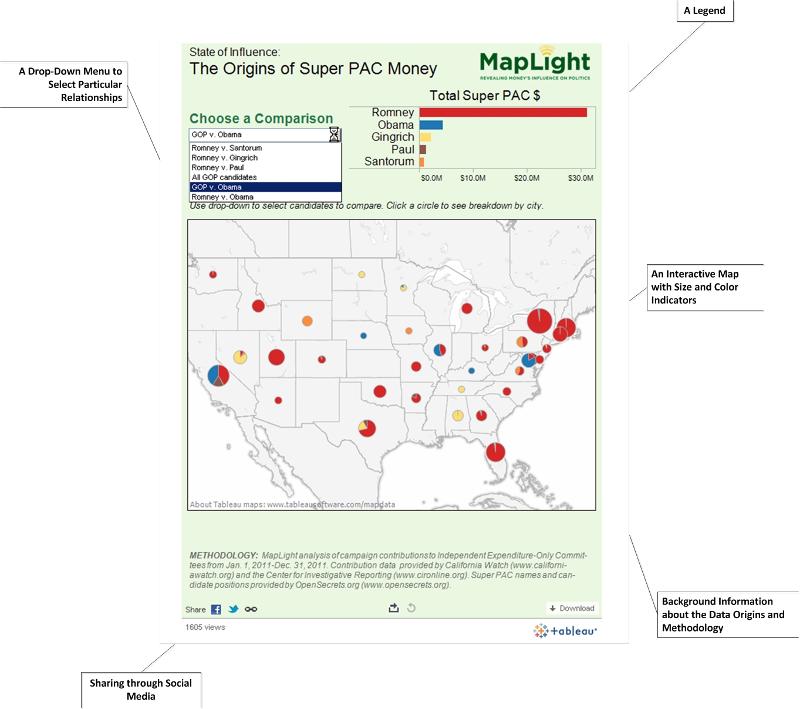
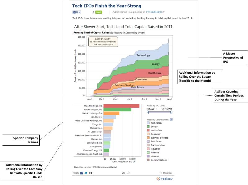
The following visuals come from two popular data visualizations that were featured in early 2012.
Some basic tenets of electronic information follow:
References
Aid, M.M. (2009). The secret sentry: The untold history of the National Security Agency. New York: Bloomsbury Press.
Andrejevic, M. (2009). iSpy: Surveillance and power in the interactive era. Lawrence: University Press of Kansas.
Glenny, M. (2011). DarkMarket: Cyberthieves, cybercops and you. New York: Random House.
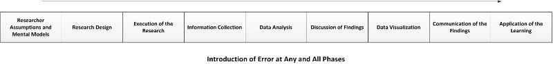
The table below lists some of the common research methods in higher education... This is not an exhaustive listing by any means. This is included just to spark some thinking about some of the more formalized methods of research.
|
Quantitative (Research) Methods |
Qualitative (Research) Methods |
Mixed (Research) Methods |
|
empirical experiments structured records reviews surveys / questionnaires historical research and analysis
(based on a range of statistical analysis methods) |
fieldwork (in a natural setting) Delphi study grounded theory heuristic research interviewing surveys / questionnaires case studies portraiture historical research and analysis
(emergent vs. pre-determined research)
|
a combination
meta-analyses (qual, quant and mixed methods)
(a mix of information gathering and statistical analysis) |
Applied Information Basics
Shape: Almost all information has some "shape" or pattern. Very little is formless. Very little is actually and totally random (except when it is, according to author Nassim Nicholas Taleb).
Absence / Presence: What is seen may be relevant. What is not seen in the research may be relevant.
Surveillance: Understanding a situation is about surveillance--regular intervals (or constant) observations and measures. From this, an observer establishes a baseline. From this, an observer may notice anomalies.
Context for Meaning: Information is about context. Outside of context, information may lack relevance.
Framing and Interpretation: Information is about focus. It is about point-of-view. It is about assumed values. Information is about (subjective) interpretation. (This is why it's helpful to game-out various points-of-view and possible interpretations of the same set of information.) People make inferences about raw data and in so doing process it into usable information.
A Framing Animation
Predictive Analytics and Hidden Information: Predictive analytics is about trendlines. It is about human habituation and predictability of future actions based on data points. It is about hidden information or an extension of what is non-intuitively knowable. (See Charles Duhigg's "The Power of Habit," 2012.)
Modeling: All simulations are based on underlying information. Without knowing the assumptions of the model, one cannot truly assess whether the model has any value. Beyond that, a model has to track with the factual world, so there have to be points where the model's predictions may be tested against the world.
Omniscience: Competition in information is about knowing something critical without others knowing. It is about knowing earlier. It is about situational awareness.
Following the Rules
Creating and Deploying Effective Surveys
Ensure that all survey instruments are phrased so as to avoid bias. (Question Design)
Phrase questions to focus on one issue at a time. Avoid double-barreled questions.
Ensure that surveys reach a sizeable random sample of a population, not an accidental defined sub-set. (Survey Methodology)
Ensure that all surveys questions used have been tested for multi-collinearity (to eliminate sample items that measure similar things). It is important to avoid conflating very similar factors. The variables being tested in a context should be as different and independent from each other as possible. If there is overlap, there will be unnecessary "noise" in the data.
Not Over-Reaching in Terms of Generalizability
Do not over-generalize. Draw conclusions only in proper measure.
Do not confuse correlation with causation. (Just because two events occur in close time proximity does not mean that there is necessarily a causal relationship between them.)
Make sure there is sufficient information before making an important decision. (This is all about due diligence.)
Sometimes, researchers are observing and assessing one thing but confusing it with another. There's a risk to conflation especially if the two compared objects are potentially close in relationship. The tests for "multi-collearity" is an attempt to separate the measures for one factor from another potentially closely related factor.
Coding Data Methodically
Coding data appropriately
Maximizing the Data Collection to Saturation
Building a strong repository of complete and relevant information for the "triangulation" of data
Breaking "The Law of Small Numbers"
If a sample size is too small, the findings will be much more exaggerated (with more extremes and outlier effects) than for larger samples. Too often, analysts read causal observations when the "null hypothesis" cannot actually be rejected (Kahneman, 2011, p. 118).
Applying Logic
Avoid endogeneity. Do not confuse a cause-and-effect when the effect could be coming from a factor within the system instead of outside the system. Or there may be factors affecting a result that is not even considered in the modeling.
Consider all possible interpretations of the data.
Applying the Base Rate
Statistics can be helpful in aiding an analyst in understanding the probabilities in a particular circumstance. A "base rate" is the general statistical probability for a particular occurrence. A "base rate fallacy" occurs when people go with judging an outcome by considering irrelevant information and without considering basic probabilities (Kahneman, 2011).
Avoiding the WYSIATI (What You See is All There Is) Fallacy
Kahneman (2011) talks about the fallacy of "What You See is All There Is" (WYSIATI). People do not often consider the "unknown unknowns" or unseen evidence. An analyst should consider all evidence on a wide spectrum so as not to close off an exploration too soon. Fixing too soon on a possible explanation may be misleading.
Triangulating Data
Compare various data streams to get a fuller view of an issue. The more you will be generalizing and / or the higher the risk of the judgment, the more due diligence has to be done.
Information Sampling over Time
Sometimes, researchers will only do a slice-of-time sample and yet extrapolate results that might imply continuous time. It may help to sample over longer time periods for greater generalizability.
Go with the Counter Narrative
Test out other points of view and data sets. Work hard to debunk your own stance or interpretation. Dis-believe. (This stance can either strengthen your stance or weaken it.)
Be Leery of "Cognitive Ease"
Be aware of the ease of accessing certain explanations because that ease-of-access often translates to an early explanation and certitude which may be incorrect. Kahneman (2011) talks about the risks of "cognitive ease" in analysis and decision-making. Further, he describes two cognitive systems in people. System 1 is automatic and quick and activates with "no sense of voluntary control." It is intuitive and tends towards gullibility. (p. 20) System 2 is used for complex computations. It tends towards dis-believing. This system is much more logical and analytical; it is linked with "the subjective experience of agency, choice, and concentration." (p. 21) Too often, people go with System 1 when they should be applying System 2. System 1 is easier to access than System 2, and it requires less cognitive focus.
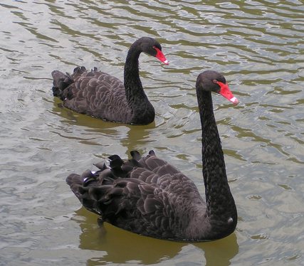
(This is an image of two black swans released through Creative Commons licensure.)
Black Swans
"Black Swan" events are outlier events. They are rare but high-impact events that fall outside paradigms and outside bell curves (so-called "normal distribution" curves). Thinking too much within paradigms and bell curves makes black swans even more inconceivable, which leaves people unprepared for such outsized events.
The Explanatory Value of "Black Swans"
"A small number of Black Swans explain almost everything in our world, from the success of ideas and religions, to the dynamics of historical events, to elements of our own personal lives. Ever since we left the Pleistocene, some ten millennia ago, the effect of these Black Swans has been increasing. It started accelerating during the industrial revolution, as the world started getting more complicated, while ordinary events, the ones we study and discuss and try to predict from reading the newspapers, have become increasingly inconsequential" (Taleb, 2010, p. xxii). The world is about "non-linearities," non-routines, randomness, and true serendipity.
Other Problems with Current Uses of Data
Not Bell Curves: Taleb calls the use of "Gaussian bell curves" a kind of "reductionism of the deluded." The bell curve exists in a theoretical space, not in the real; it does not exist outside the Gaussian family. A "random walk" considers possibilities, but it has severe limits--the limits of the analytical framework.
 not
not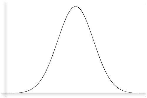
(A fractal by Wolfgang Beyer, released through Creative Commons licensure; a generic bell curve or "normal distribution")
The Limits of Mathematization
"Furthermore, assuming chance has anything to do with mathematics, what little mathematization we can do in the real world does not assume the mild randomness represented by the bell curve, but rather scalable wild randomness. What can be mathematized is usually not Gaussian, but Mandelbrotian." (Taleb, 2010, p. 128)
Fractals and Mandelbrotian Randomness
" Fractal Is a word Mandelbrot coined to describe the geometry of the rough and broken—from the Latin fractus, the origin of fractured. Fractality is the repetition of geometric patterns at different scales, revealing smaller and smaller versions of themselves. Small parts resemble, to some degree, the whole." (Taleb, 2010, p. 257)
Exponentially Large Scalable Effects and the Rationale for Fractals
The real world has non-linearities that are not accounted for in bell curves. Real-world challenges mean that events may have scalable effects that magnifying effects. Taleb writes: "Like many biological variables, life expectancy is from Mediocristan, that is, it is subjected to mild randomness. It is not scalable, since the older we get, the less likely we are to live. In a developed country a newborn female is expected to die at around 79, according to insurance tables. When she reaches her 79th birthday, her life expectancy, assuming that she is in typical health, is another 10 years. At the age of 90, she should have another 4.7 years to go. At the age of 100, 2.5 years. At the age of 119, if she miraculously lives that long, she should have about nine months left. As she lives beyond the expected date of death, the number of additional years to go decreases. This illustrates the major property of random variables related to the bell curve. The conditional expectation of additional life drops as a person gets older.
"With human projects and ventures we have another story. These are often scalable...With scalable variables, the ones from Extremistan, you will witness the exact opposite effect. Let's say a project is expected to terminate in 79 days, the same expectation in days as the newborn female has in years. On the 79th day, if the project is not finished, it will be expected to take another 25 days to complete. But on the 90th day, if the project is still not completed, it should have about 58 days to go. On the 100th, it should have 89 days to go. On the 119th, it should have an extra 149 days. On day 600, if the project is not done, you will be expected to need an extra 1,590 days. As you see, the longer you wait, the longer you will be expected to wait." (Taleb, 2010, p. 159).
Fractals as the Framework
"Fractals should be the default, the approximation, the framework. They do not solve the Black Swan problem and do not turn all Black Swans into predictable events, but they significantly mitigate the Black Swan problem by making such large events conceivable." (Taleb, 2010, p. 262)
Accounting for "Fat Tails": C. Steiner (2012) suggests that it may be better to consider that there is unpredictability with human irrationalities...which may result in "fat tails." These are the ends of the bell curve, which theoretically stretch into infinity.
Really, One Cautionary Note
References
Kahneman, D. (2011). Thinking, Fast and Slow. New York: Farrar, Straus and Giroux.
Steiner, C. (2012). Automate this: How algorithms came to rule our world. New York: Portfolio / Penguin.
Taleb, N.N. (2010/2007). The black swan: The impact of the highly improbable. New York: Random House.
A Classic Rectangular Data Array / Data Structure
The "schema" of the data (in a spreadsheet) should be defined in a clear way. Tableau Public ingests data using a classic rectangular data array (which is the typical form used in SPSS, Excel, SAS, and other programs). The rows represent unique cases. The columns represent variables. The far-left column should consist of identifiers. The absolute top row should consist of labels for the variables.
The world is mapped according to a geographic coordinate system (which consists of latitude, longitude and elevation; the first two of which represent horizontal positions and the latter of which represents a vertical position). These three points represent any physical space in the world.
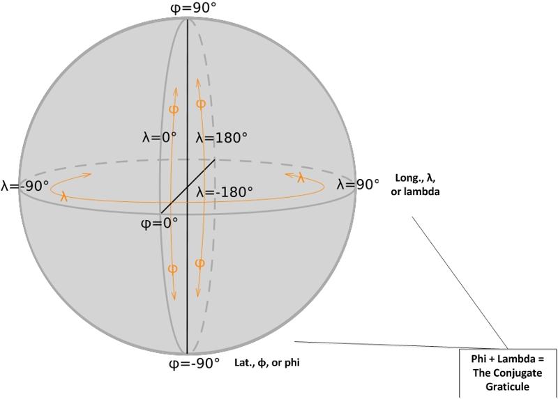
(This image of the geographic coordinates on a sphere was created by E^(nix) and released via a Creative Commons license.)
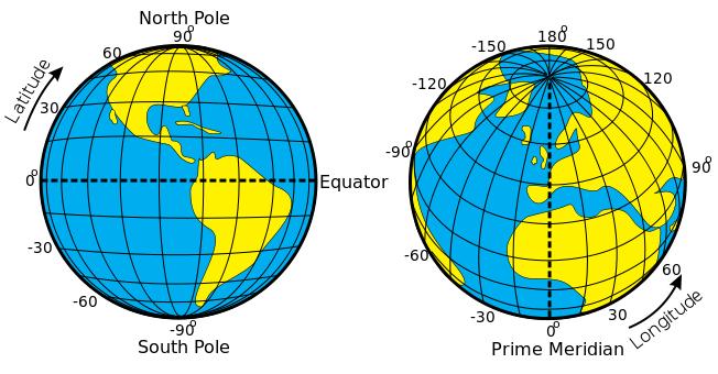
(This image of the latitude and the longitude of the earth was made by Djexplo, and it was released with a Creative Commons license.)
![]() (You are here...)
(You are here...)
Common Data Set Initiative
K-State and Common Data Sets (Office of Planning and Analysis)
K-State 2010 - 2011 Data
The Mock Data Set (an Excel file)
A Spatialized Map View (Widget with Embed Text)
(A spatialized map offers one interactive visualization of data.)
The Dashboard View (iFrame with Live Links)
(A dashboard combines several visualizations of the data.)
Acknowledgments: Thanks to Scott Finkeldei for the mock data set from K-State.
("Electricity")
Data.Gov
http://www.data.gov/
U.S. Census Data (2010)
http://2010.census.gov/2010census/data/
U.S. Census Bureau
http://www.census.gov/
U.S. Census Bureau / The 2012 Statistical Abstract (especially Sections and .xl downloads)
http://www.census.gov/compendia/statab/
National Center for Education Statistics
http://www.data.gov/
Creating a Data Visualization Using Tableau Public (downloadable PowerPoint version)
The Kansas Board of Regents (KSBOR)
Institutional Gap Calculation
Global Demographic Trends
Gapminder
http://www.gapminder.org/
Dr. Hans Rosling
"No More Boring Data" (TED, 2007)
http://www.youtube.com/watch?v=hVimVzgtD6w
"New Insights on Poverty" (TED, 2007)
http://www.ted.com/talks/hans_rosling_reveals_new_insights_on_poverty.html
"Let my Dataset Change your Mindset" (TED, 2009)
http://www.ted.com/talks/hans_rosling_at_state.html
"Hans Rosling: Asia's rise—how and when" (TED, 2009)
http://www.ted.com/talks/hans_rosling_asia_s_rise_how_and_when.html
"Hans Rosling on Global Population Growth" (TED, 2010)
http://www.ted.com/talks/hans_rosling_on_global_population_growth.html
"Hans Rosling: The good news of the decade?" (TED, 2010)
http://www.ted.com/talks/hans_rosling_the_good_news_of_the_decade.html
"Hans Rosling and the magic washing machine" (TED, 2011)
http://www.ted.com/talks/hans_rosling_and_the_magic_washing_machine.html
Geological Visualizations
US Geological Survey (USGS)
http://glovis.usgs.gov/ (Global Visualization)
USGS Seamless Data Warehouse
http://seamless.usgs.gov/
USGS EarthExplorer
http://earthexplorer.usgs.gov/
Disease Distribution and Spatiality
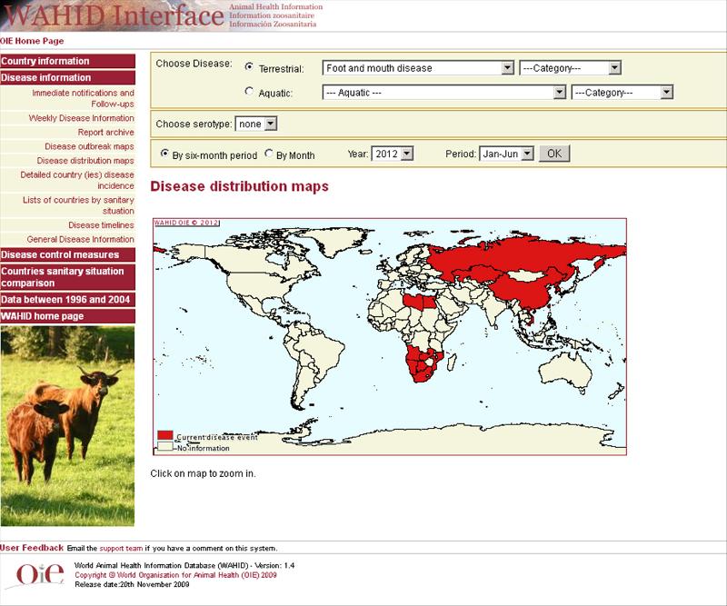
OIE: World Organization for Animal Health / Interactive Disease Distribution Maps
(World Animal Health Information Database / WAHID Interface)
http://web.oie.int/wahis/public.php?page=disease_status_map&WAHIDPHPSESSID=e898489703716cef784208fdfd399f64
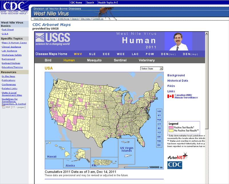
CDC Arbonet Maps
http://www.cdc.gov/ncidod/dvbid/westnile/USGS_frame.html
Educational Knowledge Tracking
Khan Academy
http://www.khanacademy.org/exercisedashboard
http://www.khanacademy.org/login?continue=http%3A//www.khanacademy.org/profile
The Analysis of Large Data Sets (Terabytes of Data, Billions of Records)
Google BigQuery (2010)
https://developers.google.com/bigquery/
Google Research Blog
http://googleresearch.blogspot.com/
Using Excel for Web Visualizations
Data Wiz Blog
http://datawiz.wordpress.com/
|
Dr. Shalin Hai-Jew Instructional Designer Kansas State University 785-532-5262 shalin@k-state.edu
|
Note: This presentation was built using SoftChalk 7. The Flash animation was built with Adobe AfterEffects. Microsoft Visio was used for the annotated screenshots with the pull-outs of information. Adobe Photoshop was used for minor photo editing. A Web-based ASCII-art generator was used to create the ASCII-text art.
This was updated in May 2012.