
(An Early Exploration and "TMI" Musing on Data)
Shalin Hai-Jew, Kansas State University
Colleague to Colleague Spring Forum 2012
(Apr. 20, 2012, Hutchinson Community College)
With complex data sets of educational information available, it helps to be able to provide Web-accessible and interactive visualizations of this data for more understandable analysis, collaborative decision-making, and public awareness.
complex information + visualization = improved knowability and analyzability (and improved application of that information--optimally)
Tableau Public is a free tool (albeit a hosted solution) that enables the uploading of complex data (in .xl and .txt formats) for intuitive presentations on the Web. Such depictions offer accessible ways of understanding interrelationships, trends over time, and predictive analytics. The Web outputs are dynamic and engaging. This is the next step up from static information but somewhat less than full learner tracking and resultant full-scale simulations based on that data. Come learn about this tool and some of its possible uses in educational data visualization and light analytics.
![]()
The Data
the raw data set (and its history)
the potential of the data into the future
the methodology of information collection
the combination of data sets (customized data integration through "rationalization" and "normalization" of data; the scrubbing of data for clean data sets for comparability), including those with null data fields
the elimination of skewing outliers or anomalies (if relevant)
The Visualization
x and y axes (and z)
2D and movements of elements
3D visualizations
interactive dashboards
informational labels
Cautions
the "metamers" (illusions) in data visualization (with "negative learning" to be avoided)
the analysis and conclusions drawn from data analysis
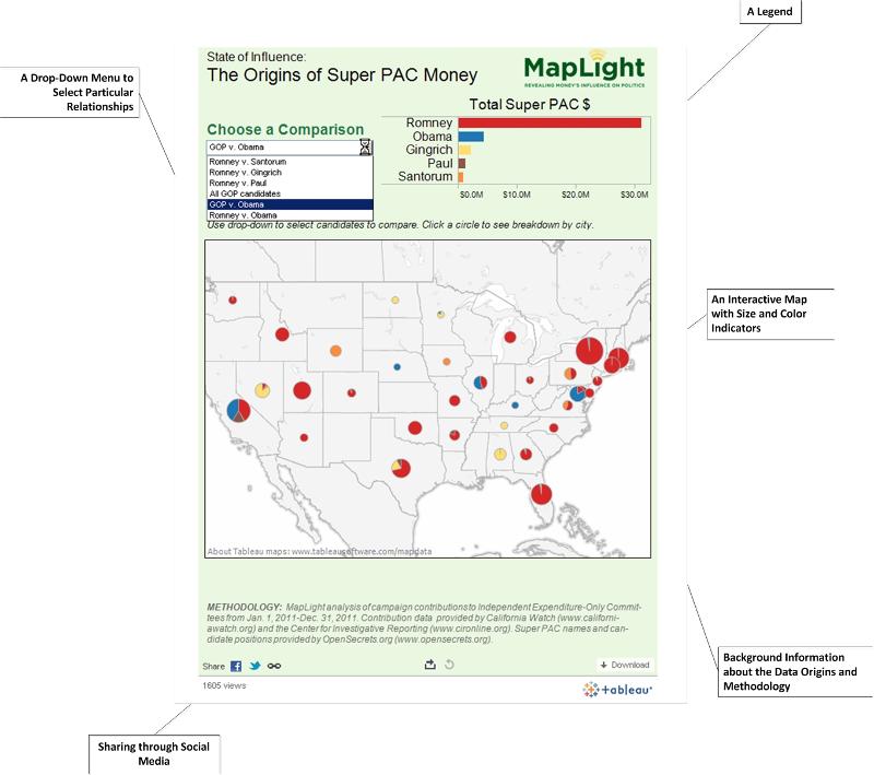
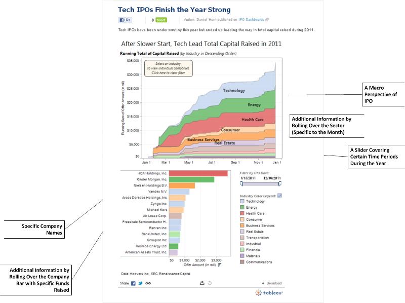
The following visuals come from two popular data visualizations that were featured in early 2012.
toc | return to top | next page
