

Data Visualization:
Drawing with Data, with Concepts, and with Rules
SIDLIT 2013
Summer Institute on Distance Learning and Instructional Technology
(Colleague 2 Colleague)
August 1 - 2, 2013
@Johnson County Community College in Overland Park, Kansas
by Shalin Hai-Jew, Kansas State University
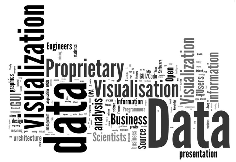
Fig. 1: The above is a Wordle(TM) diagram representing word frequencies in the current "data visualization" entry on Wikipedia. This "word cloud" data visualization may be accessed off of the Wordle Gallery at this location.
Presentation Description: Data visualizations enhance human comprehension, analysis, decision-making, and predictions. Data visualizations will be shown from three origins: (1) data, (2) concepts, and (3) rules. This begins with a basic data set structure and related visualizations in Excel. Then, various network visualizations will be shown from the free open-source NodeXL. A specialized map dashboard will be output from the free Tableau Public. Then, there will be a simple process of manual conceptual drawing in Microsoft Visio. Finally, there will be some rule-based visualizations expressed as changes over time (through agent-based modeling) with the free open-source tool NetLogo and its Models Library.
From Data to Data Visualization
The "datafication" of society refers to a recent phenomena of turning aspects of the world into data that may be measurable, assessed, and analyzed. Broadly speaking, "structured" data refers to data of a particular defined type. Basic information types are numerical or textual. Within even those limitations, much information may be collected and understood. "Unstructured" data is multi-modal or multi-type data. The descriptions of data are known as "metadata" (data about data). There are many types of data structures (aka ontologies or taxonomies).
In the current age, there is much in the way of data collection. Governments collect plenty of data. Social media platforms collect data. Information and communication technologies (ICT) collect data. There are various types of sensor networks that collect data. People often leave "data exhaust" as a byproduct of the modern lives that they live.
For our purposes, worksheet flat tables have basic structures. The clear labeling of data variables is critical. Data sets should be as complete as possible, without gaps in information. The unique identifiers in a data set enable cross-comparisons across a range of different data sets.
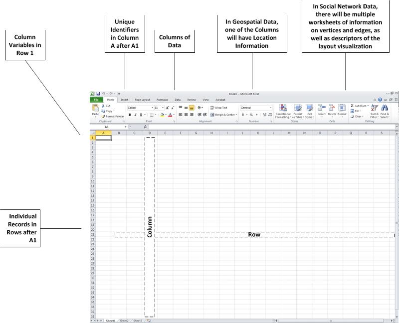
Fig. 2: A Worksheet Data Structure
Spreadsheet programs are used for pivot tables as well, which offer more information than flat tables. Pivot tables also include data that has been extrapolated as a function.
The act of data visualization, simply described, involves taking numerical, textual, spatial, and / or other data and rendering it in two-dimensional (2D, with an x-axis and a y-axis) or three-dimensional (3D, with an x, y, and z axis) visual form. Various types of data may be overlaid / compared / cross-analyzed with other data as long as there is a common variable to enable accurate relating of mixed records.
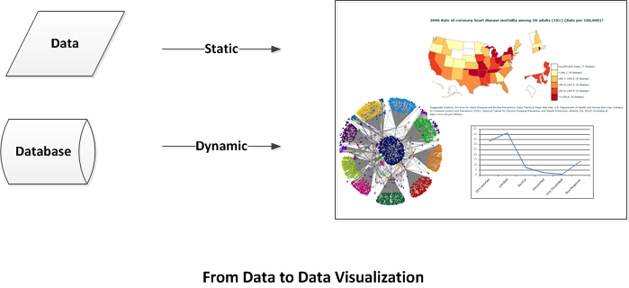
Fig. 3: From Data to Data Visualization
Conventions of the Field: The conversion of data to a visualization depends on the conventions of the field, the types of data managed, and how the data is used for human comprehension, analysis, decision-making, and predictions. They enable short-hand access to the underlying data through the uses of shapes, lines, colors, text, and sound (sometimes) to communicate meaning. In data visualizations, the use of space and spatial relations is important. Symbols (such as arrows) are important. Colors are important signifiers. Map and graph legends and textual pullouts and contextual text...are all important. Lines and line sizes and labels are important. Directionality is also important.
Applications of Data Visualizations: Data visualizations are simplifications or summarizations of the underlying data. As such, it is important to understand how the data was collected and to have access to the original data set(s) for deeper understandings. It is important to recognize how the original data are condensed and represented visually to enhance the accuracy of "visual mining" (perusing the visualization for understandings, trends, relationships, and other knowledge). The original data set enables analysis to individual record-levels of "atomistic" granularity. Data may be cross-referenced, sub-setting, extracted, abstracted, compared, contrasted, and "manipulated" in a variety of ways for informational value.
Disfluency: Data visualizations are created to probe data for more meaning. It is part of the analysis process that enables additional knowing. Sometimes, "disfluent" or dissonant representations of data may enhance analysis instead of an easeful and superficial view of the data. Disfluency may be used to combat "confirmation bias" in people and encourage new ways of seeing, analysis, and decision-making. (Said another way: Surprise can help people to reconsider assumptions.)
Complementary Usage: Data visualizations are used in a complementary way with the raw or processed data sets. The provenance (the origins of and the sequential processing) of data for the visualization is also important to consider for data validity. Data visualization is one method for turning raw data into information (something that offers understanding and analytical value).
