

(1) Drawing with Data
Definition: Applying layout algorithms to data to create data visualizations
To draw with data means to let the data "structure itself" based on a set of data rules. Some of the examples below will illustrate how data can form a relational "structure." Depending on how the data was acquired, this may be considered empirical data captured by observation from the real world.
Microsoft Excel
Data visualizations from Microsoft Excel are fairly familiar. Certain types of data align more "naturally" (by convention and logic) with particular types of visual depictions.
Microsoft Excel is a proprietary and commercial software tool.
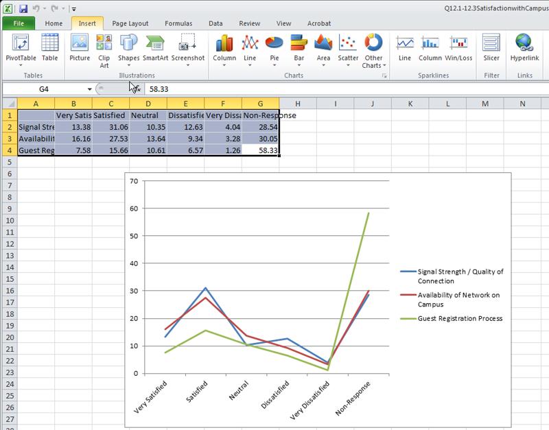
Fig. 4: A Screenshot of a Microsoft Excel Dataset and Related Linegraph
(We will conduct a few Excel visualizations with simple real-world survey data.)
NodeXL: Network Overview, Discovery and Exploration for Excel
A fairly recent kind of data visualization involves the depiction of "networks". These may be networks of people, information (contents), concepts, and any sort of relationship between "entities." The analysis of such networks are known as "network science." One subset of this learning involves social network analysis, and a subset of that would be electronic social network analysis.
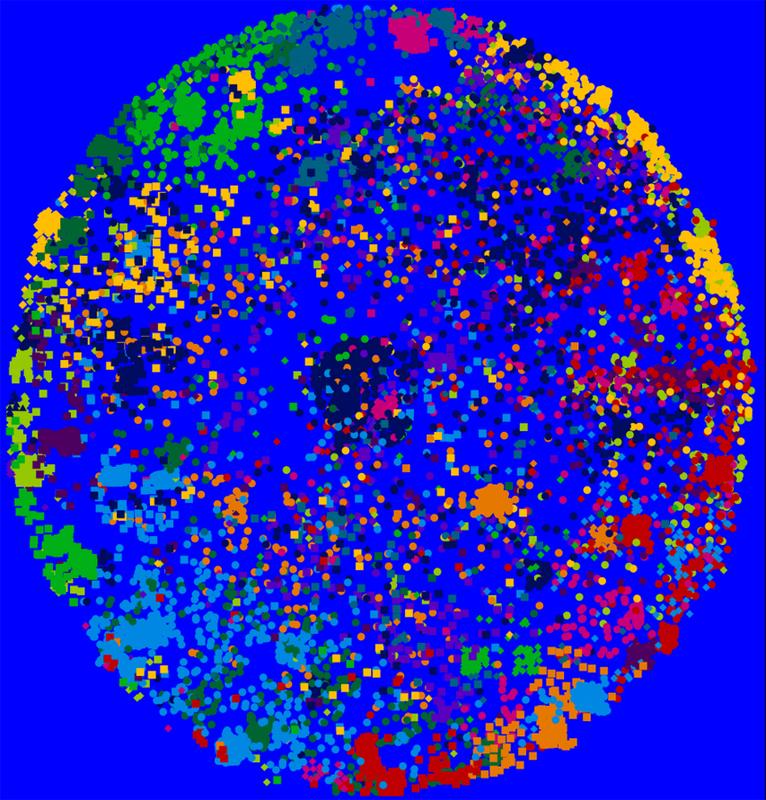
Fig. 5: A Data Crawl of the Barton Gellman User Network on Twitter and Visualized (Creatively) Using NodeXL
NodeXl (Network Overview, Discovery and Exploration for Excel) is a free and open-source add-in to Excel. It may be downloaded at the NodeXL space on CodePlex. This tool runs on more recent versions of Excel on PCs or on parallels on Macs. One functionality of this tool enables the extraction of data from social media platforms (like Twitter, Flickr, YouTube, and in a limited way, Facebook). Further, this tool may ingest contents from wikis through the use of the "web crawler" VOSON (Virtual Observatory for the Study of Online Networks) add-in to this tool. Some look to electronic data from social media platforms as information from "human sensor networks." In this concept, each human being's "data exhaust" and metadata may be used to observe particular phenomena.
In the demo, participants will see how one dataset may be visualized in a range of different ways.
- The Fruchterman-Reingold layout algorithm is force-based, which will be shown with multiple sequential visualizations with greater levels of repelling force between vertices (nodes) in each iteration.
- The Harel-Koren Fast Multiscale layout method pulls out clustering in eye-catching ways.
- The circle (lattice graph) layout method places vertices (nodes) in a circle, with edges (links) inside the circle.
- The spiral graph puts the vertices (nodes) in a spiral, with edges (links) connecting the various nodes on the spiral.
- The horizontal sine wave bases the vertices on a sine wave, with the edges connecting the nodes.
- The vertical sine wave bases the vertices on a vertical sine wave.
- The grid places all nodes on a treemap, with the links in the background. This is especially visually arresting for larger data sets.
- The polar layout enables the focus on one central node and places the others around it by distance from the center in a ring (Vertex Polar R as a radius position with 0 at the center and 1 at the circle), and rotation as an angle from 0 to 360 degrees (Vertex Polar Angle)
- The Sugiyama graph is also a highly condensed one. This visualization algorithm tries to "minimize edge crossings."
- The random layout randomizes the graph data and depicts the members of the graph network in a randomized representation of the vertices (nodes) without an obvious structure.
To understand these layout algorithms in depth, an individual would do well to return to the original research and academic papers that describe these. The descriptions here are extremely cursory.
The NodeXL Excel template worksheet may be accessed at #datavisualization hashtag (Excel file) based on the data extraction (crawl) on June 2013.
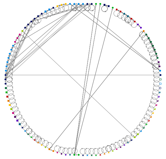
Fig. 6: A Lattice Graph of the #datavisualization hashtag search on Twitter (unlimited crawl) using NodeXL
Visit the NodeXL Graph Gallery.
For more information on electronic social network analysis, please refer to the following slideshow.
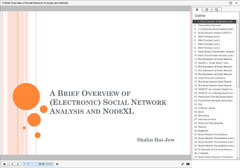
Fig. 7: "A Brief Overview of (Electronic) Social Network Analysis and NodeXL"
Book Resource: The book "Analyzing Social Media Networks with NodeXL: Insights from a Connected World" (2011, Elsevier) by Derek Hansen, Ben Schneiderman, and Marc A. Smith, is a powerful resource.
Tableau Public 8.0
Another type of data structure involves the mapping of data to a location. Because people live and move in space, and there are influences of geographical / physical spatial proximity, this tool helps map data to place. The free and public version enables connection to data from MS Access, MS Excel, and text files. Those with professional access may draw data from specific servers. (The free version enables server access using OData or Windows Azure Marketplace DataMarket.)
The location data may be accessed with a column from zip codes, area codes, latitudes / longitudes (coordinate data), ISO country codes, FIPS codes, county / state / country names, and other forms.
The free Tableau Public version is limited by license and is a simplified version of a commercial software tool.
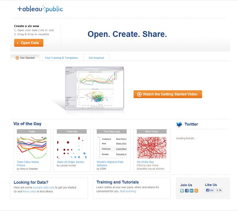
Fig. 8: A Screenshot of the Landing Page for Tableau Public
Visualizations may be seen in the Tableau Public Gallery. The related datasets may also be downloaded from the site.
Every Recorded Meteorite Impact on Earth: http://www.tableausoftware.com/public/gallery/registered-meteorite-impacts
Childbirth Economics: http://www.tableausoftware.com/public/gallery/childbirth-economics
New Planets: http://www.tableausoftware.com/public/gallery/newplanets
Fungal Meningitis Outbreaks: http://www.tableausoftware.com/public/gallery/fungal-meningitis-outbreaks
The World's Nuclear Reactors: http://www.tableausoftware.com/public/gallery/nuclear-reactors
Some World Agriculture Statistics (based on World Bank Databank Data)
![]()
![]()
Or you may visit the link directly here.
International Debt Statistics (World Bank) (based on World Bank Databank Data)
![]()
![]()
Or you may visit the link directly here.
MIT Media Lab's "Immersion"
![]()
![]()
MapBox's Global Twitter Heat Map
![]()
![]()
(Thanks to Eric Dover for the MapBox reference.)
