Creating "Clean" Data Sets
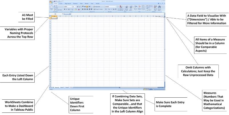
A Classic Rectangular Data Array / Data Structure
The "schema" of the data (in a spreadsheet) should be defined in a clear way. Tableau Public ingests data using a classic rectangular data array (which is the typical form used in SPSS, Excel, SAS, and other programs). The rows represent unique cases. The columns represent variables. The far-left column should consist of identifiers. The absolute top row should consist of labels for the variables.
Acquiring Local Data Sets for Online Learning
- survey systems
- learning / course management systems
- program statistics
- college and university statistics
Spatiality: The World is Mapped
The world is mapped according to a geographic coordinate system (which consists of latitude, longitude and elevation; the first two of which represent horizontal positions and the latter of which represents a vertical position). These three points represent any physical space in the world.
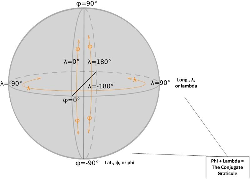
(This image of the geographic coordinates on a sphere was created by E^(nix) and released via a Creative Commons license.)
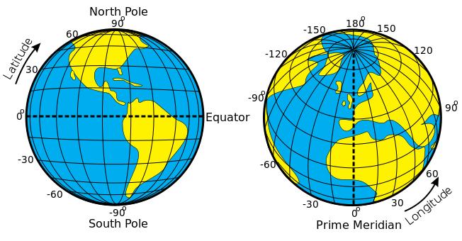
(This image of the latitude and the longitude of the earth was made by Djexplo, and it was released with a Creative Commons license.)
Why Does Spatiality Matter?
![]() (You are here...)
(You are here...)
- Most of what happens in the world happens in real time-space. Both space and time must be defined in order to "ground" the experience.
- Business owners study the density of potential competitor businesses before deciding to start a particular business. They also study the population of the various environments to ensure that they may be able to have a sufficient base to support their business.
- Law enforcement maps certain events that may be related in order to understand if there may be certain geographical patterns to the behaviors. They place suspects in space-time in order to rule them in or out as continuing suspects.
- Epidemiologists will map the spread of disease over certain locales for certain periods of time for disease "rates". Projections are built into the future based on the behaviors of a certain disease spread in space-time.
- For example, a fractal map was created to show the travel patterns of people as they spread the HIV virus from individual to individual. This map identified risk zones in real-space.
- On another front, social networking visualizations (node-link diagrams and others) identified "sexual networks" that showed the higher risk of those in thick nodes with higher interactions with others (represented in vertices).
- Demographers use maps to study immigration patterns.
- Wildlife biologists study the behavior of a non-native species over certain terrain in reality and in simulations in order to help create an intervention plan. [Biogeographers determine species range to understand the species distribution over particular spaces. The species distribution changes over time because of the "translocation" of species by the dispersion by people, wind, water, and animals. These movements affect the bio-geography (the biodiversity over space and time).]
- Meteorologists use maps to project the trajectory and potential impacts of specific weather systems.
- Hydrogeochemists map various processes natural processes in the movements of elements and heavy metals through nature, over spaces.
Why Does Spatiality Matter for Online Instructors?
- Spatiality may be...
- a critical aspect of the curriculum
- a part of the problem-solving
- an aspect of the student design
- a part of the student skill set.
- Spatiality may help the instructor...
- learn particular patterns
- describe complex interrelationships
- conceptualize particular relationships
- broaden their understandings
K-State and Common Data Sets (Office of Planning and Analysis)
Trendlines
- data over time
- tendencies
- considering "black swans"
Mock K-State Distance Education Students' Data
- Maintain a pristine original dataset. (Those familiar with multimedia development understand why. This is to ensure that nothing gets corrupted in the work.)
- Make a copy of the dataset for scrubbing and possible editing.
- Do not change fundamental of each record. (The datasets will be downloadable, so each record must be preserved with its original information.)
- Cluster like-location data. (This may be expressed as zip codes; latitude and longitude; or other ways.)
- Make sure that the first row (A1 - A100...) has a listing of all the information in the columns below.
- Do the = average( ) in Excel to average the grades in one (zip code) area; otherwise, the grades seem to just sum.
- Replace the old data if there are updates. Or better yet delete the old table and rework the data.
- Clean out the browser cache. Double check to make sure that the data visualization is making sense.
- Make sure that the individual records, when viewed, make sense.
The Mock Data Set (an Excel file)
A Spatialized Map View (Widget with Embed Text)
(A spatialized map offers one interactive visualization of data.)
![]()

The Dashboard View (iFrame with Live Links)
(A dashboard combines several visualizations of the data.)
![]()
Acknowledgments: Thanks to Scott Finkeldei for the mock data set from K-State.
